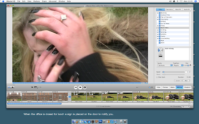
These two printscreens show that we included titles and transitions other than cuts. The little squares that attach to the frames are the transitions added. We knew we wanted fades as we have different shots after the character blinks, it changes as if she's gone to another area and time's passed. The fades would show this a little clearer if it wasn't obvious enough. We then had to decide whether we wanted fade-ins or outs. Originally we had fades out after she blinked. Looking over it a few times though one blink seemed to fade out before she finished open her eyes, we tried sorting it with altering the time but we then put fade-ins to see if it'd be easier and look better, we then ended up keeping the fade-ins on the frames after the blinks. We then finished the sequence with a fade out as we wanted to show it was finished, although it did fit as the character is attacked and just as it reaches her, it finishes, like suspense.


No comments:
Post a Comment